
Welcome Back To Our Unit Trust Discussion!
We have our system, we have our data, and we have our automation. The Untrusted, Credible, Reliable, and Trusted (UCRT) system is now ready to shine!
This week, we’re taking the next step: visualising the data for the shareholders.
The QA Dashboard
We have two main ways of visualising our Unit Trust data via the UCRT system:
🔹 The current level of Trust in the entire application or a specific Suite of Units.
🔹 The level of Trust in the entire application, a specific Suite of Units, or individual Units over time.
For more granular analysis, we can even provide the option to select a specific Unit and show the score for each bug over time — but that’s probably a bit too deep for the shareholders. So for now, we’ll stick to the two main views above.
Dashboard Widget One
For the current Trust level, I like to present the data as a tasty Pie Chart:
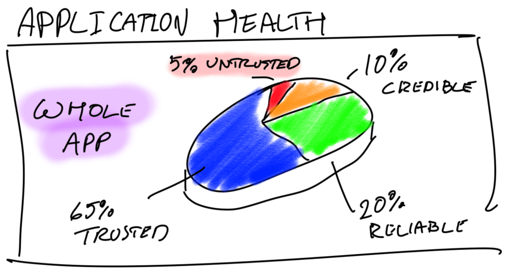
Picture this: you have the above Pie Chart on your dashboard, the “Whole App” part is a dropdown selection box where you can select with “Whole App” or Suites of Units e.g. Story Mode, UI, Peripherals etc. Like so:
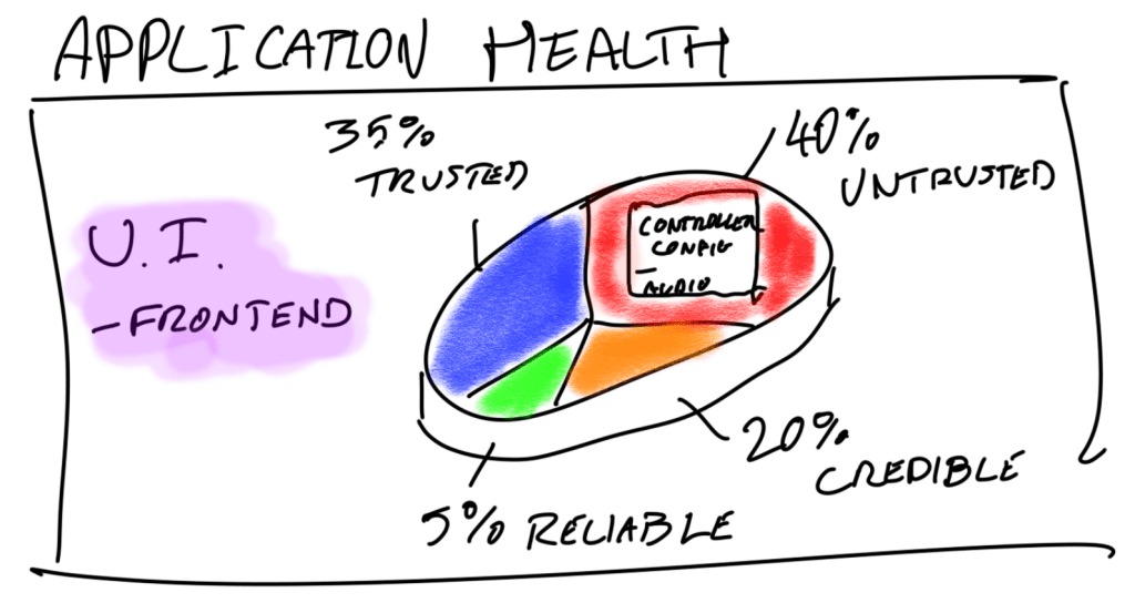
Then, in additon to the call-out lines, if you have “Whole App” selected and you mouse-over the Untrusted part of the pie, a pop lists the Suites currently in that section. If you have a specific Suite of Units selected, then the Units are displayed.
That’s “Controller Config” and “Audio” in the popup for the Untrusted section of the Frontend UI.
(Yes, I know — awesome drawing skills.)
Ultimately, it’s up to the team and shareholders to decide what an acceptable level of Application Health is before making decisions. But as you can see, this pie chart gives us a whole lot of data in a simple, digestible format.
Dashboard Widget Two
For tracking Trust Level over time, a line chart does the job perfectly!
🔹 If you’re displaying the whole app or a suite of units, you can show one line for each Trust Level rank.
🔹 If you’re zooming into a single Unit, you can plot its score passing through different “zones” over time.
Time for some more wonderful art — my favourite art teacher would be proud.
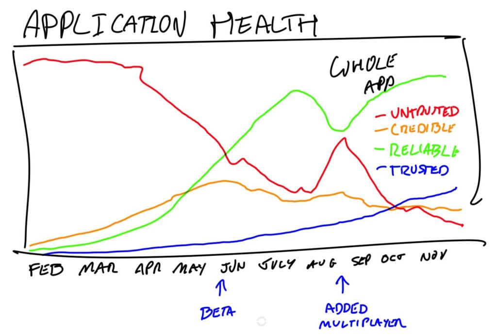
Whole Apps Trust Rank showing quantity of units in each status over time
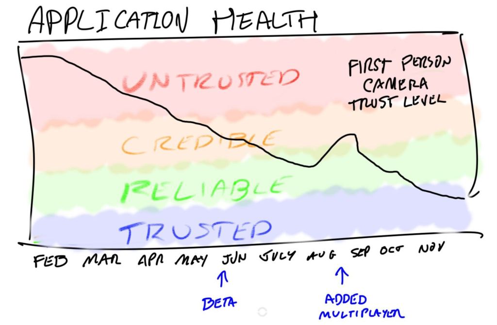
Example of “First Person Camera” unit’s trust score over time.
Totally Proud Of This System
At this point, you know the inner workings of my UCRT system: the data is captured, processed, encapsulated, and visualised.
With the dashboard widgets we’ve explored, you can see the real value of the system:
- The “Over Time” charts help identify which Suites were most affected — and to what degree — at key points during development.
- You can even use historical trends to estimate the potential impact of upcoming features. For example, when adding features to the UI, you typically see:
- 2% increase in Untrusted units
- 4% in Credible
- 1% in Reliable
Not bad at all.
All in all, we now have four widgets — and way more actionable insight than a traditional bug burndown chart!
Final Thoughts
Now that I’m at the end of this post, I’m not sure we actually need a 6th to demonstrate the actual flow charts of how the data is processed. Let me know if you think it needs some more clarity and I’ll return to the series.
As for next week, I’m going to have a think about it. Maybe some more basics, maybe some middle ground. Maybe something new! Who knows, I’ll see how I feel.
Take it easy, QA Adventurers!

Leave a comment